Flutter : Scaffold,Appbar,FAB
What is Scaffold?
A Scaffold Widget provides a framework which implements the basic material design visual layout structure of the flutter app. It provides APIs for showing drawers, snack bars and bottom sheets. Have a look at its constructor and the properties it has. We are going to overview it’s parameters one by one.
- appBar
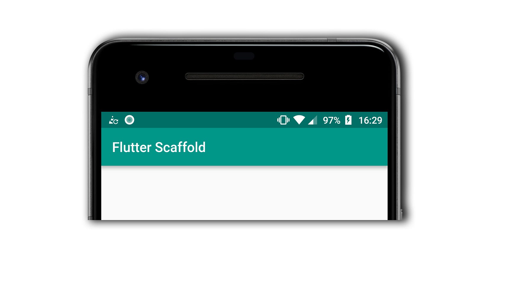
An appBar is to display at the top of the scaffold it’s one of the primary content of Scaffold without which a scaffold widget is incomplete. It defines what has to be displayed at the top of the screen. appBar uses the AppBar widget properties through Scaffold.appBar. This AppBar widget itself has various properties like title, elevation,brightness etc to name a few. - body
body is the other primary and minimum required property of the scaffold which signifies the area below the app bar and behind the floatingActionButton and drawer. Any widget in the body of scaffold is positioned at the top-left corner by default.
Widget build(BuildContext context) {
  return Scaffold(
    appBar: AppBar(
      title: Text('Flutter Scaffold'),
    ),
    body: Center(
      child: Text("This is Homepage",
        style: TextStyle(
          color: Colors.black,
          fontSize: 40.0,
          fontStyle: FontStyle.italic,
        ),
      ),
    ),
Here, the body property of the Scaffold is used to display a text “This is HomePage”. The Centre widget is used to align the text at the centre of the body and a Text widget is used to give the text along with it’s style property which gives the text a color, fontsize and fontstyle. Don’t worry this blog isn’t about the Centre or Text or TextStyle widgets, they will be covered later.
- floatingActionButton
A floatingActionButton is a button displayed floating above body in the bottom right corner. It is a circular icon button that hovers over content to promote a primary action in the application. floatingActionButton uses the FloatingActionButton widget properties through Scaffold.floatingActionButton.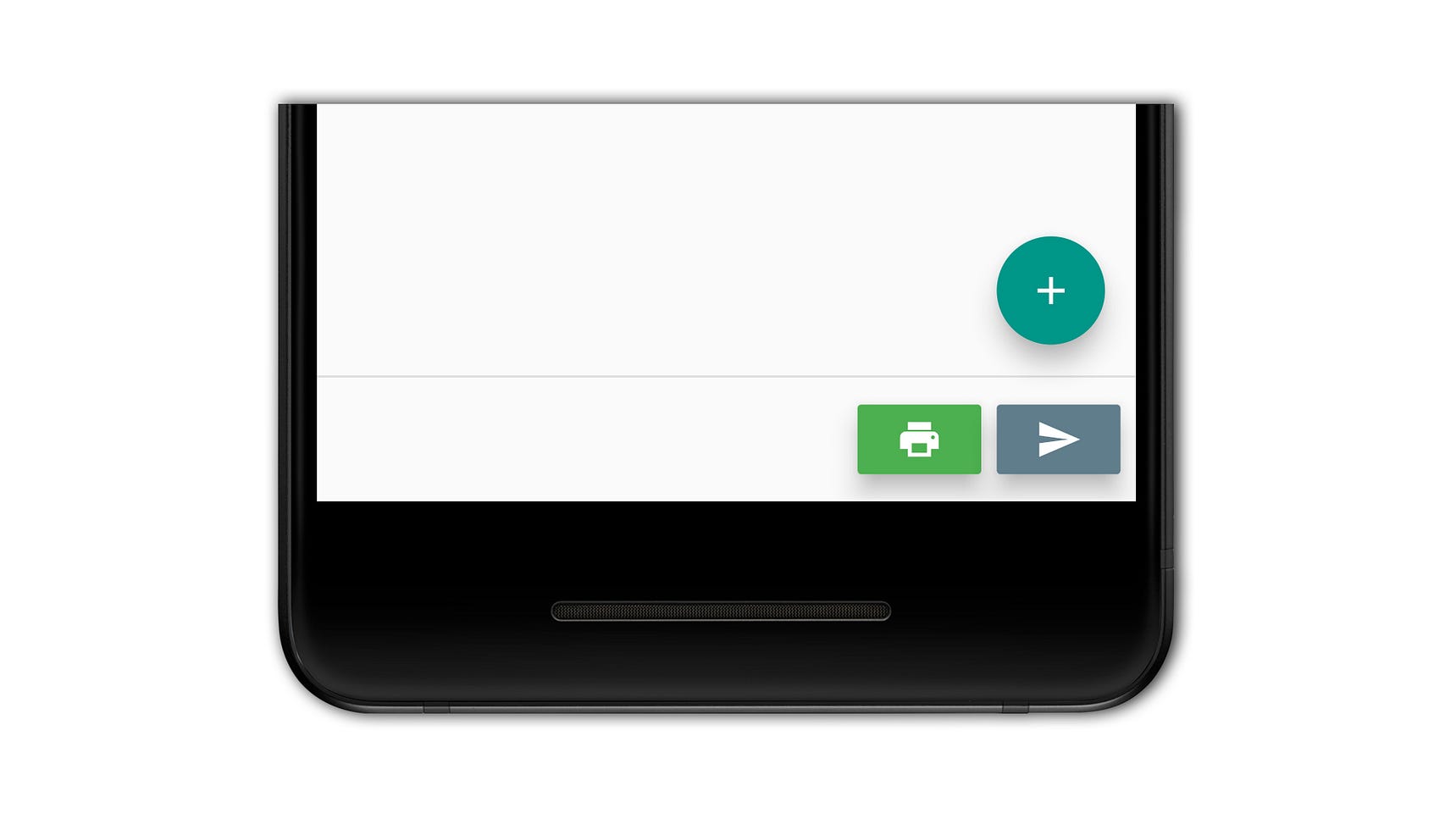
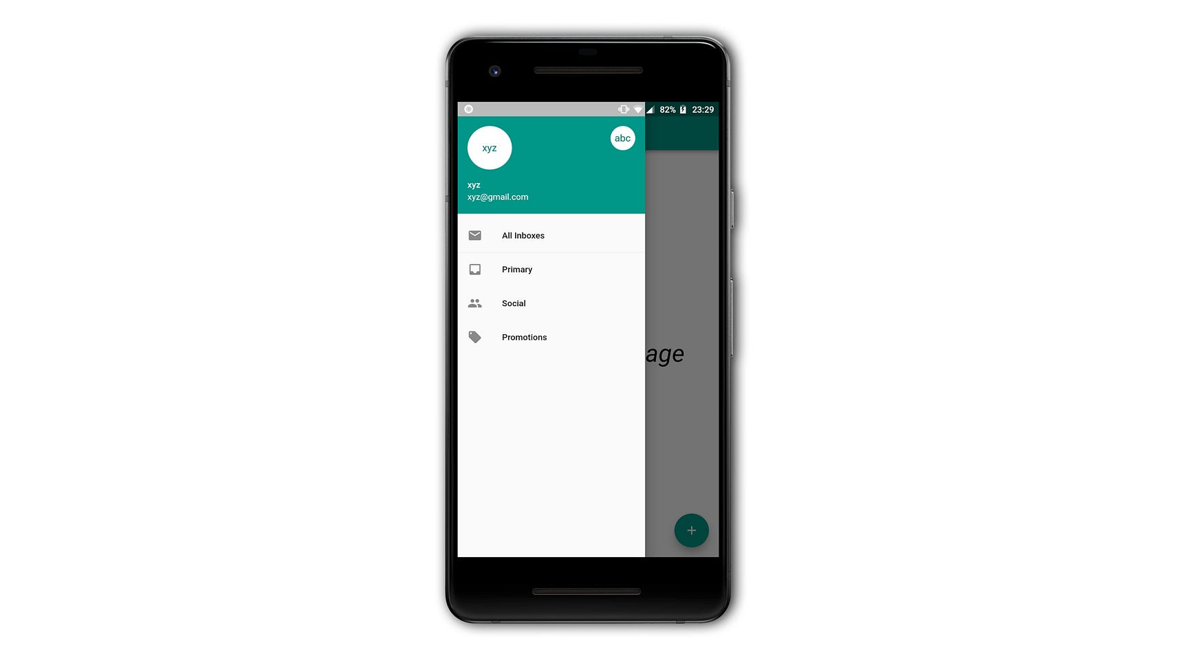
- drawer A drawer is
a panel displayed to the side of the body, often hidden on mobile
devices. One usually has to swipe left to right or right to left to
access the drawer. It uses the Drawer widget properties which is a
material design panel that slides in horizontally from the edge of a
Scaffold to show navigation links in an application and this widget is
used in scaffold using .


Comments
Post a Comment